PAGE 18! KRAUT BONER!
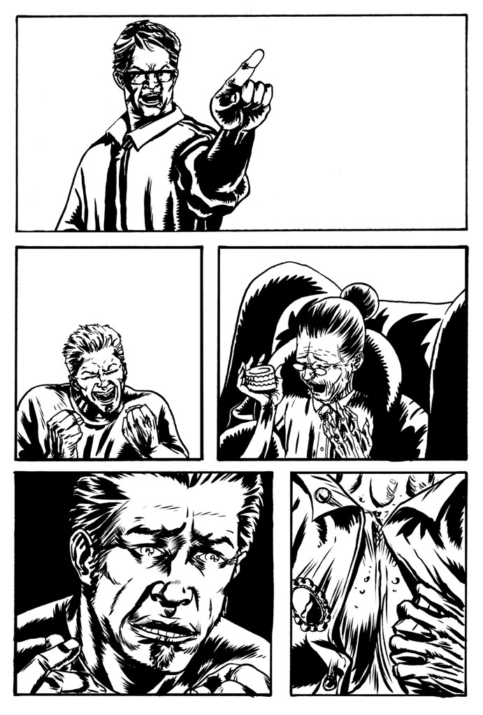
 I might actually get this issue done someday. I'm still working off my original layouts and I'm having fun doing that, this page and the six after it have some really fun stuff in them. Panel six here is of the nanny (obviously) looking through the transparency of the girl/horse picture that Quinn has placed on top/in front of her, and onto us (the camera). That might need some clarification if you don't have the next page to finish the sequence as such, you don't, cuz they are in my head. I wanted to draw the composition and not have it be a photoshop effect later, but I have no real idea how to color it. Enjoy Aaron. If you compare with the script, in panel one J is puking in his mouth a little, before he actually says he's nauseous in panel three, but thats because I drew panel three first before I got the idea to have him wretch. And in panel two, Quinn is not pointing at the badger because then I'd have to draw a cut-away, and he needs both hands to restrain a sex crazy german. Damn. I have to say it all reads pretty damn well.