skip to main |
skip to sidebar

Why, Hello!
LINKS of DISTINCTION
- bartaking.com
- Alex Fukui
- Andrew Herbst
- Ashby Utting
- Barbara Schulz
- Caitlin Skaalrud
- Comics Reporter
- Ed Choy Moorman
- George Folz
- geotypografika
- Hanna Blumerreich
- Hedwig Vinson
- La Mano 21
- Madeline Queripel
- Neville McKinnie
- Peter Wartman
- Ryan Kelly
- Salina Trevino
- Terry Beatty
- The Beat
- The Fearless Monster Hunters
Followers
One of these doohickies!


2 comments:
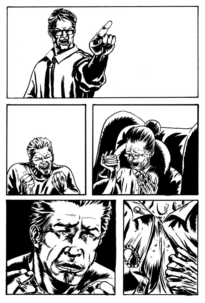
Mostly betterer. I think J's mouth (bottom left panel) looks better in the first one, although the rest of his head is improved. Also, Seth's pointing under-forearm looked better all black like the first. But those kinda fixes are what photoshop is for...
Still, better than anything I can do!
word. i agree with the mouth thing, i was trying something different, trying to convey some sort of terror and repulsion. that might get cut and pasted.
Post a Comment